| Type | Advertising |
| Client | Torino Jazz Festival |
| Year | 2018-2022 |
Is it soft, smooth, rough or sharp?
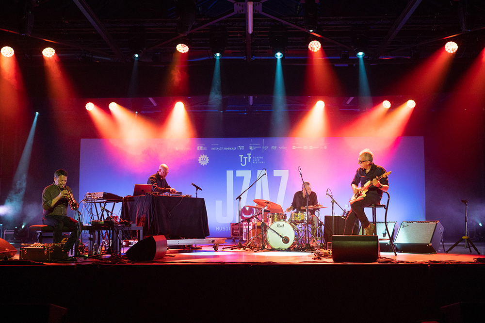
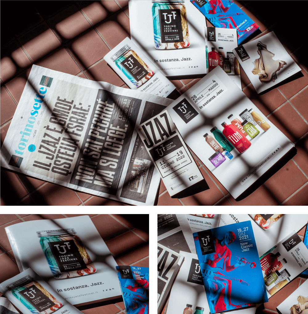
The challenge, for the first “new edition” of the Festival, was to create a visual identity that doesn’t have the classical jazz references — such as dark backgrounds, smoke, trumpet or saxophone, painted or pencil illustrations.
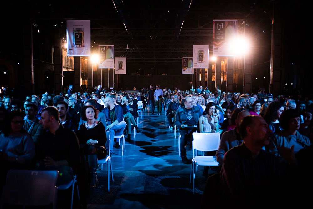
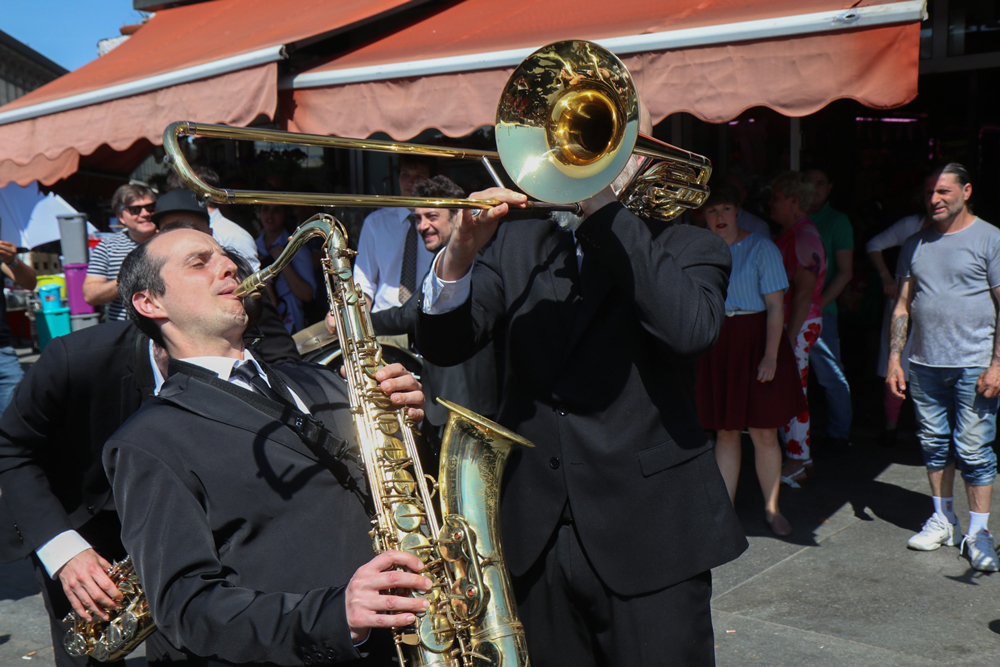
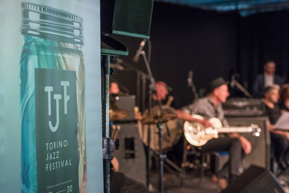
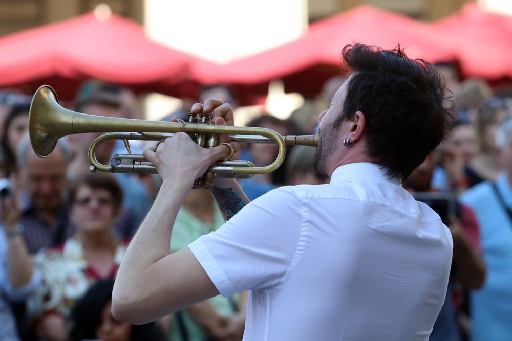
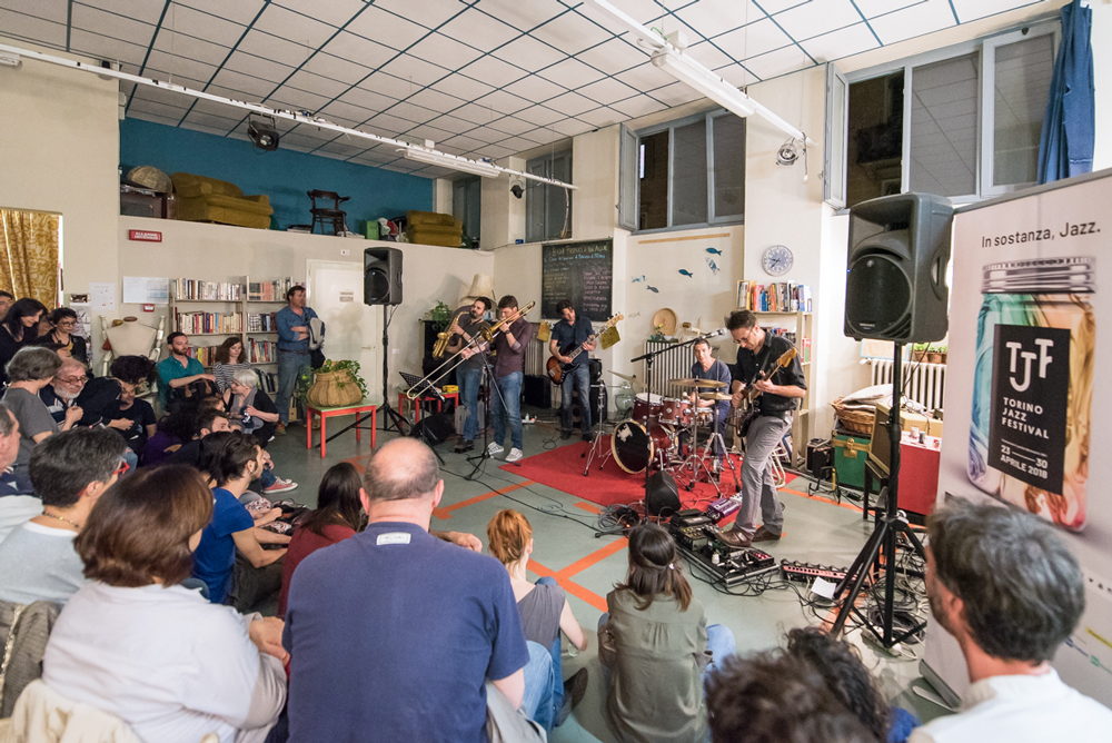
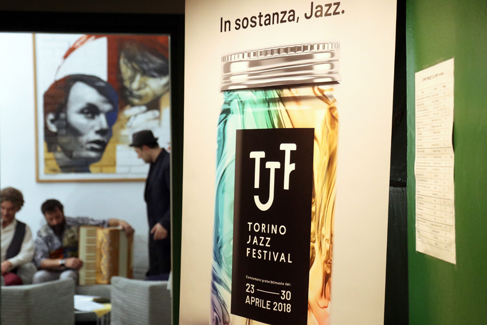
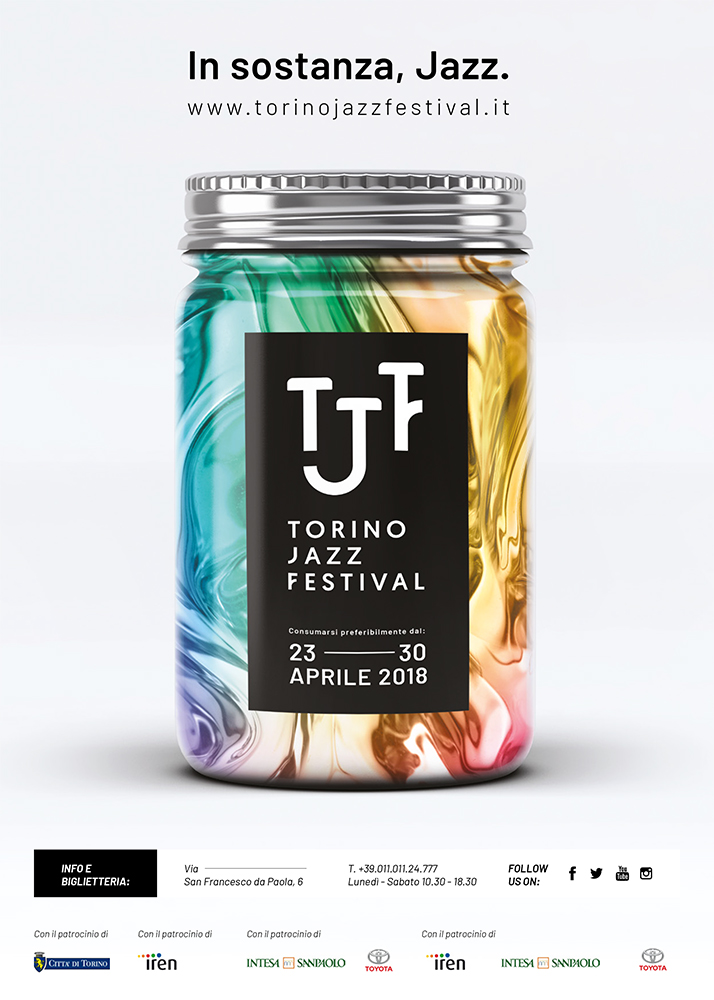
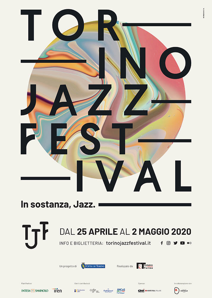
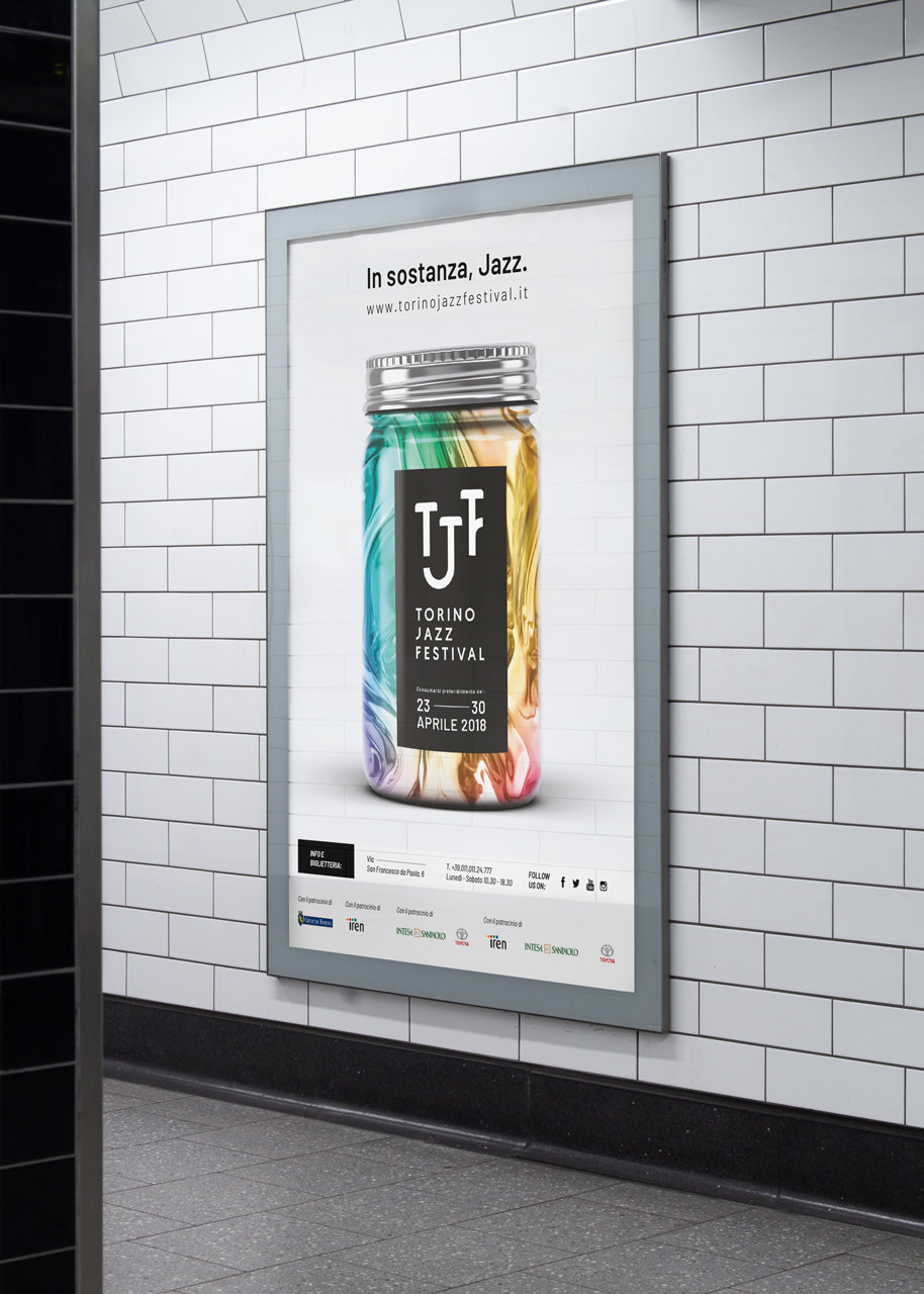
So we tried and tried different substances, photographing honey, water, ice, food…only to realize that no one form would be suitable. So we decided not to talk about its form, but about its substance. The visual was developed thinking of something far removed from jazz imagery: a jar filled with an undefined substance, ready to invade the city streets.
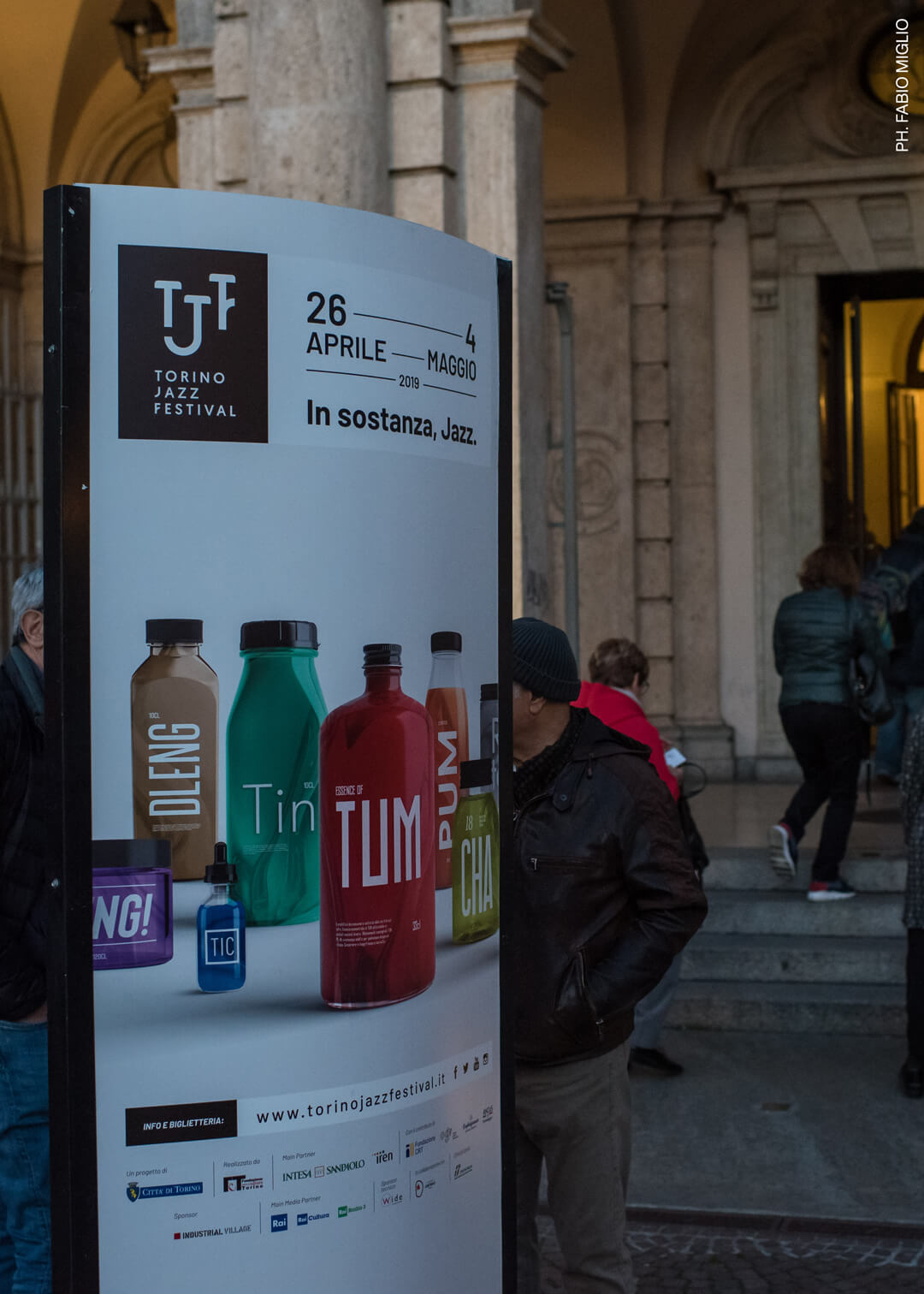
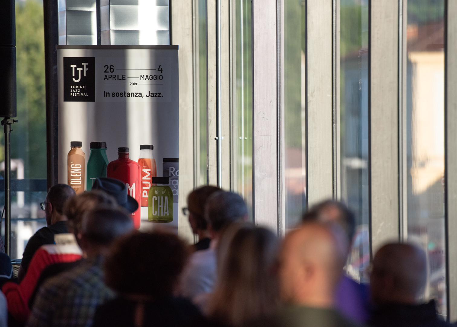
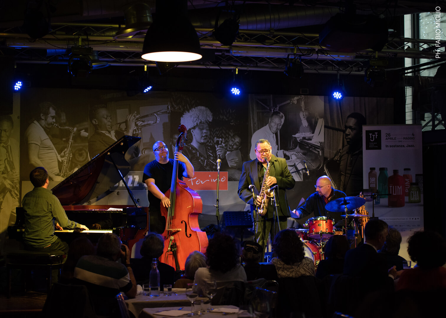
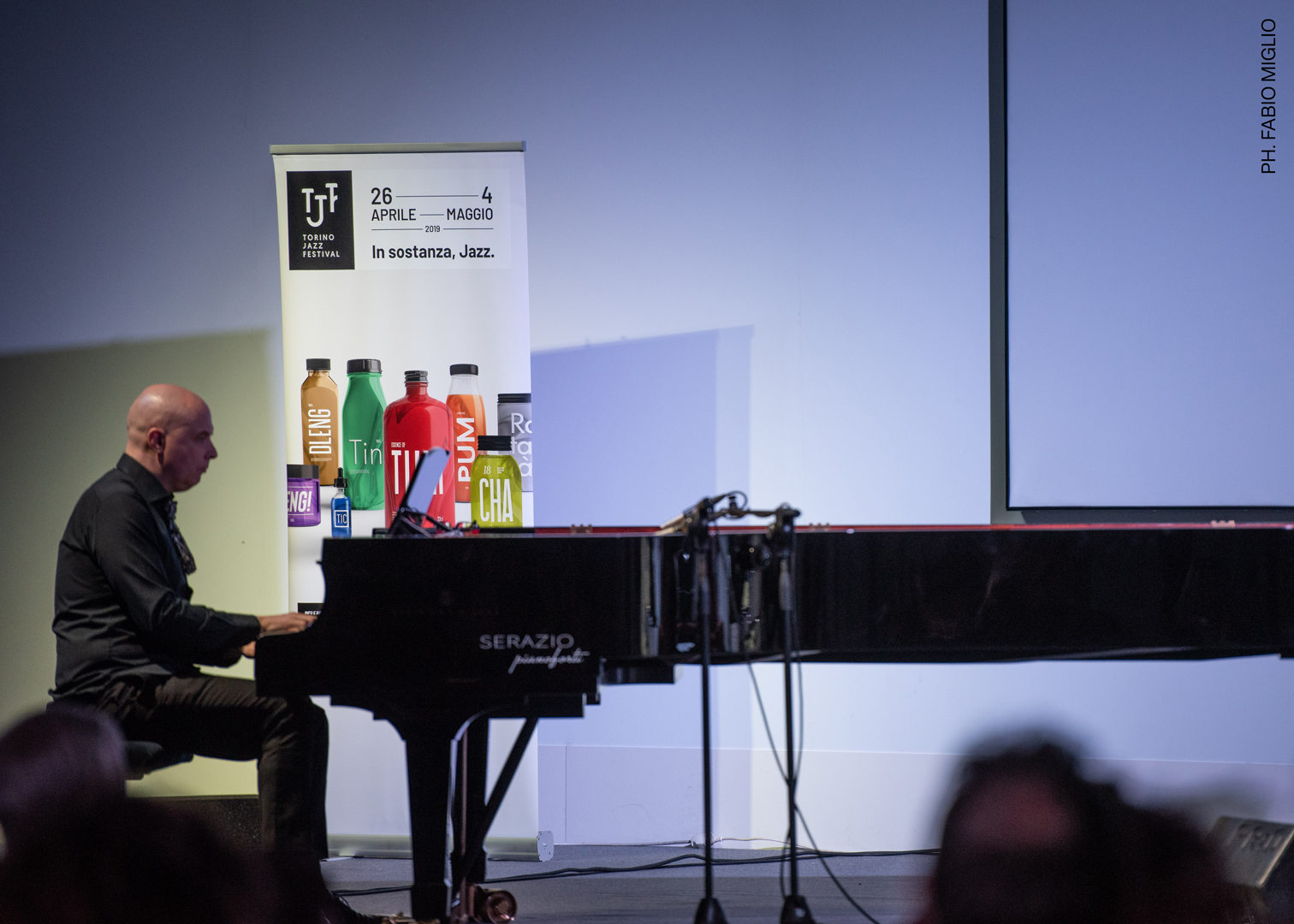
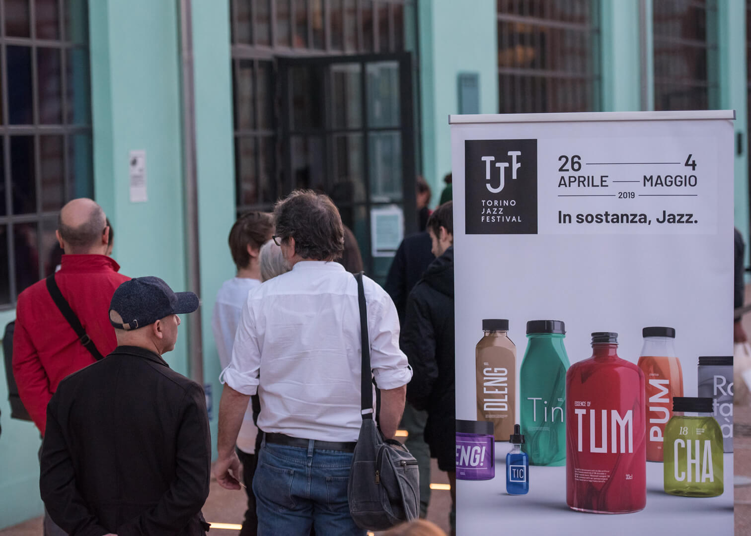
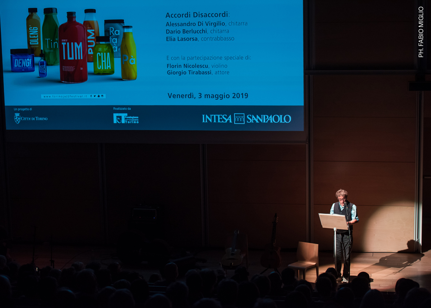
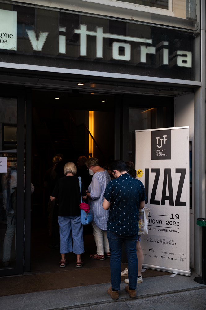
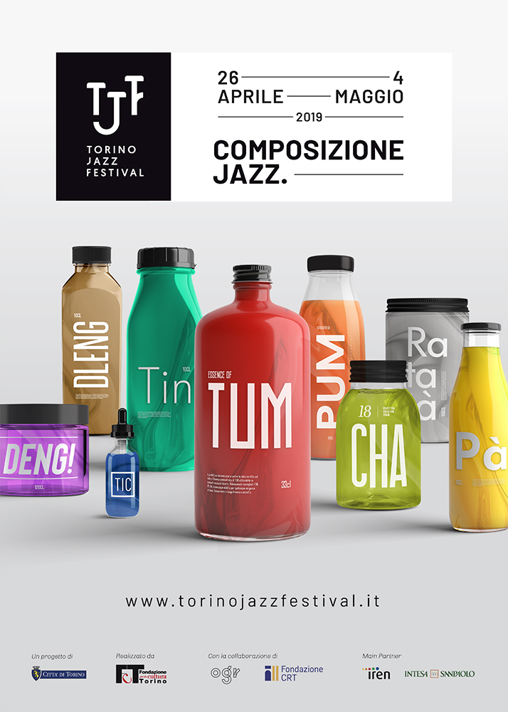
Through onomatopoeias, we filled the city with TUM, SDENG, CHA, PA and observed how people could form a rhythm in their heads just by looking at a poster.
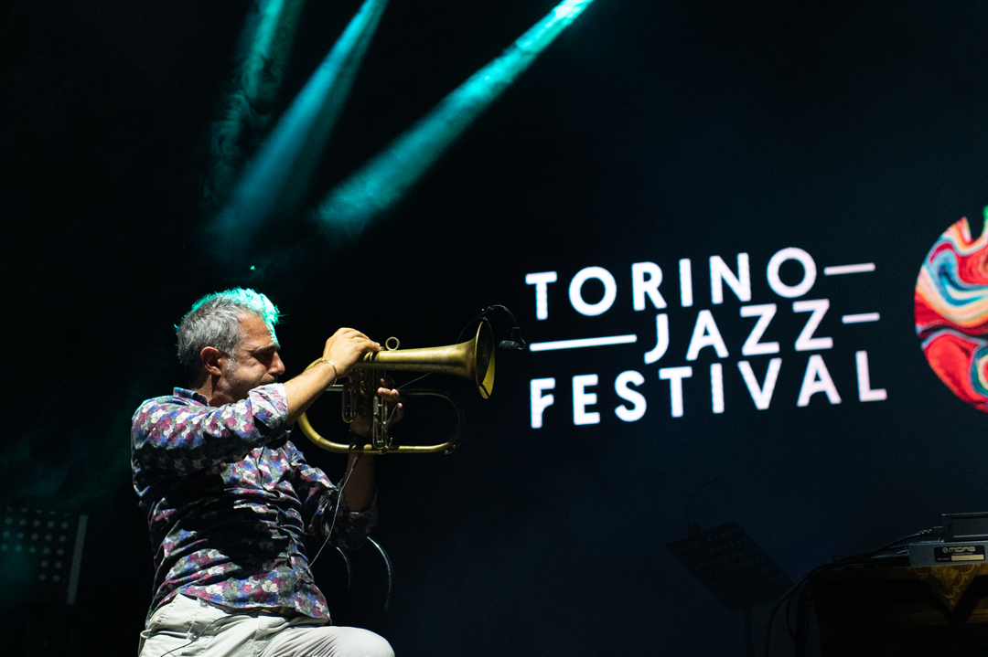
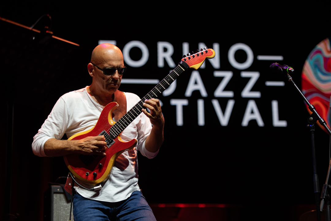
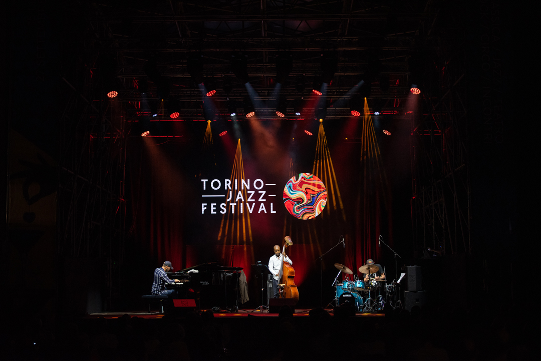
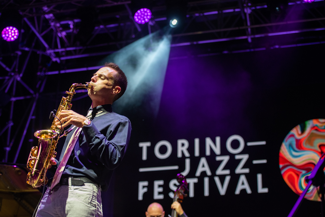
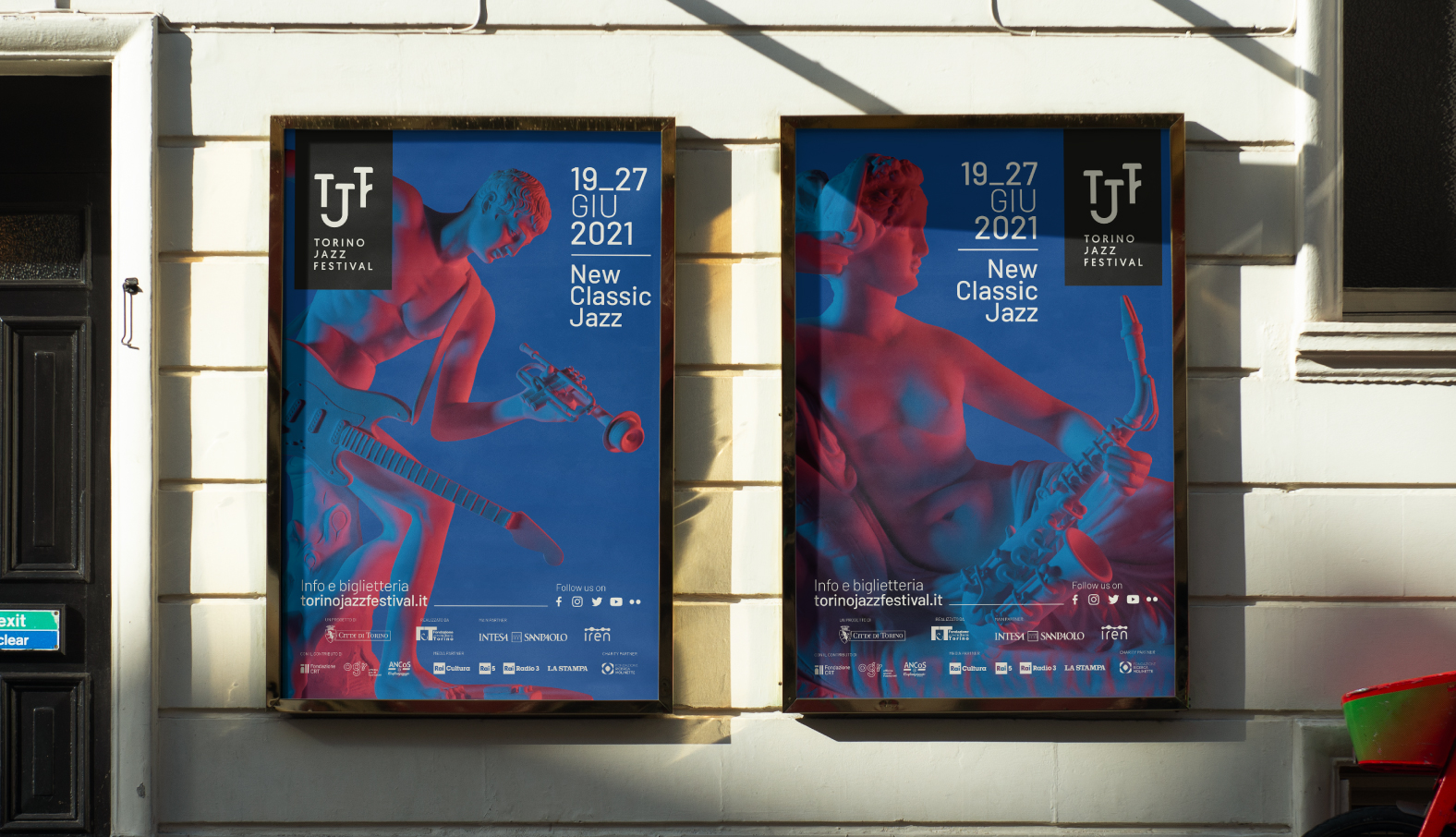
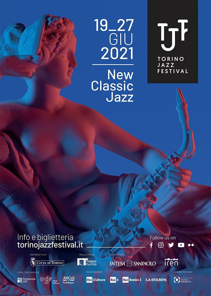
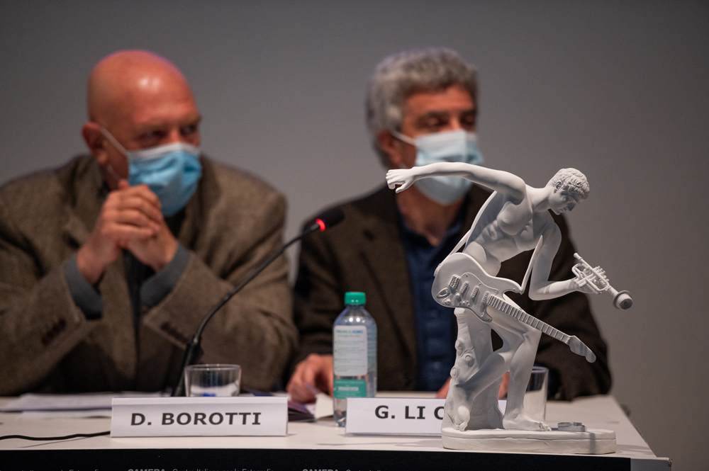
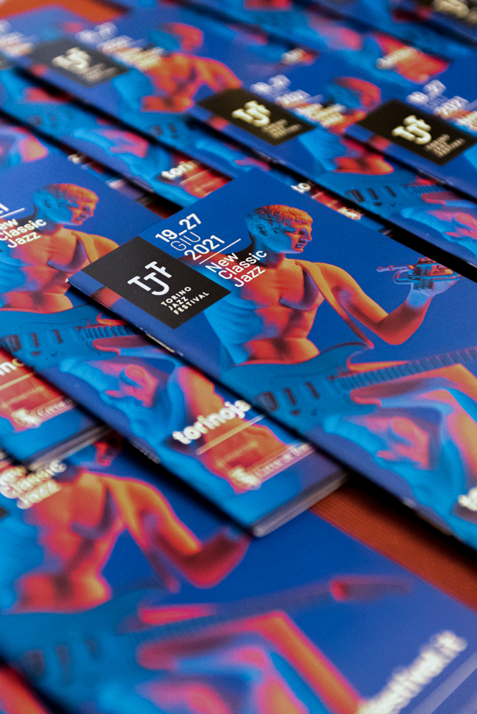
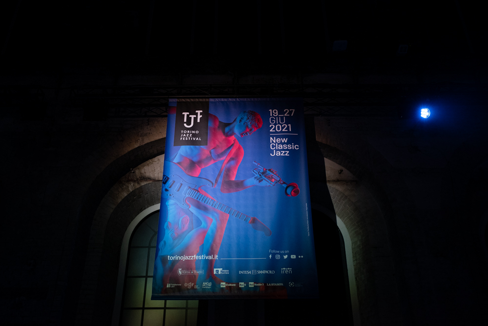
We collaborated with two sculptors to create artworks that reinterpreted two masterpieces of classical art in a jazz style. We enjoyed photographing the statues to give the classical forms a more modern, jazz-oriented twist.
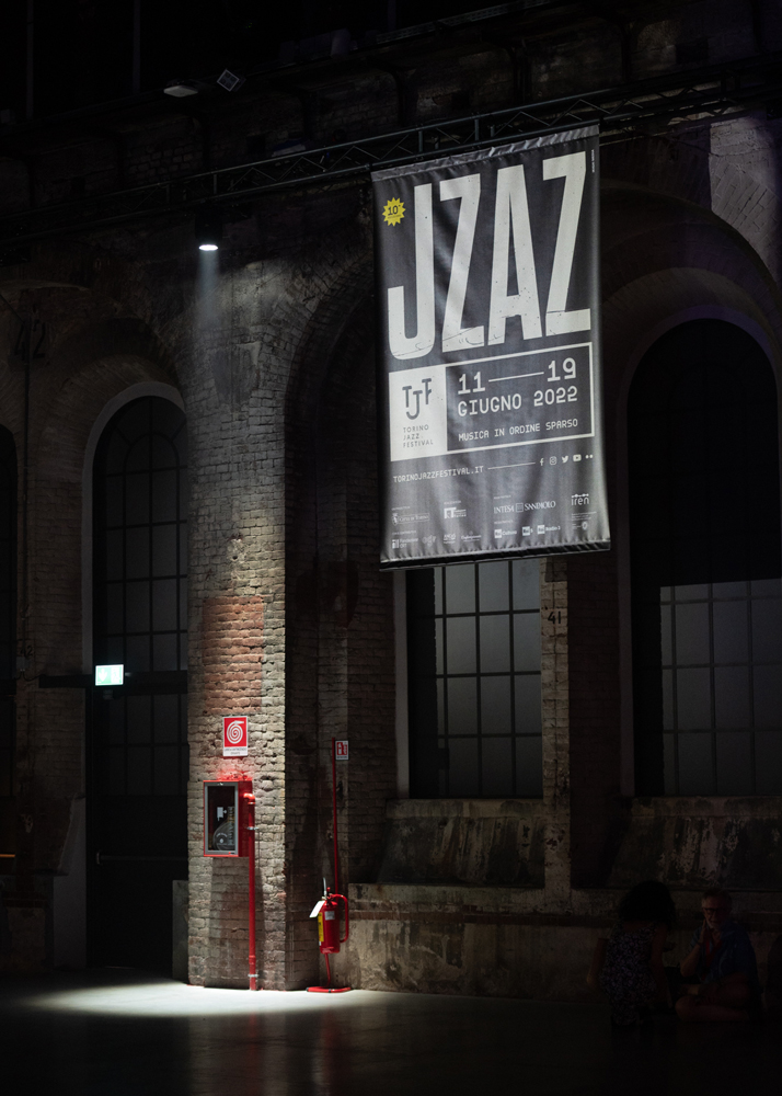
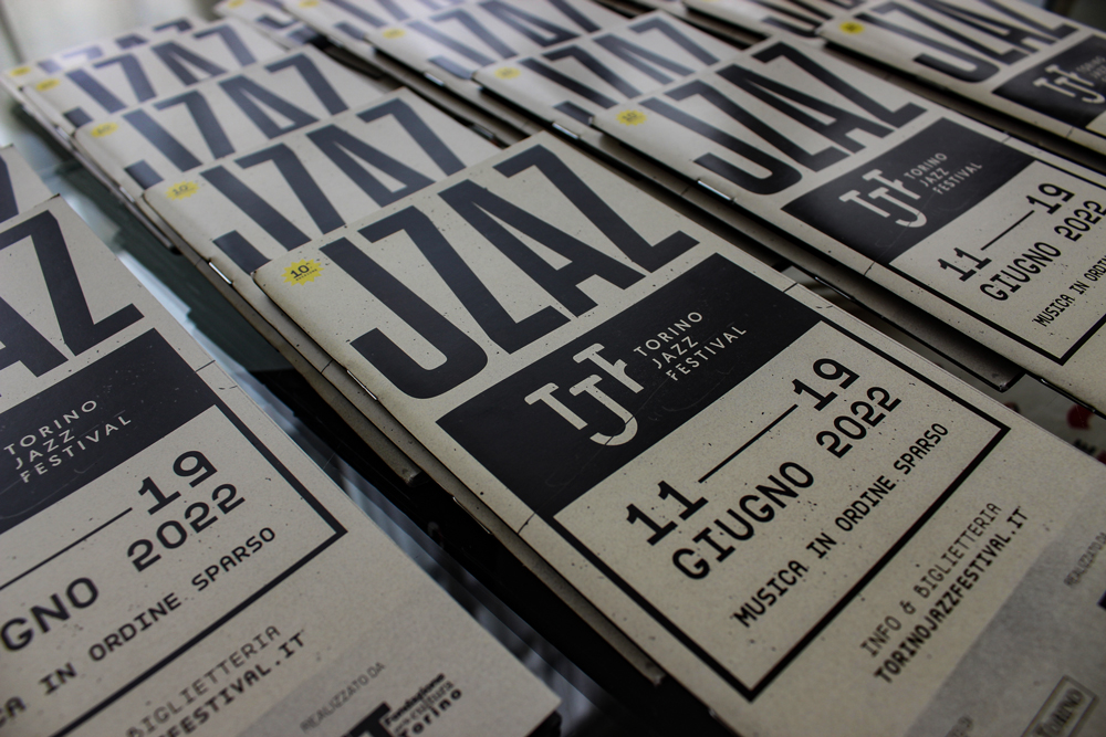
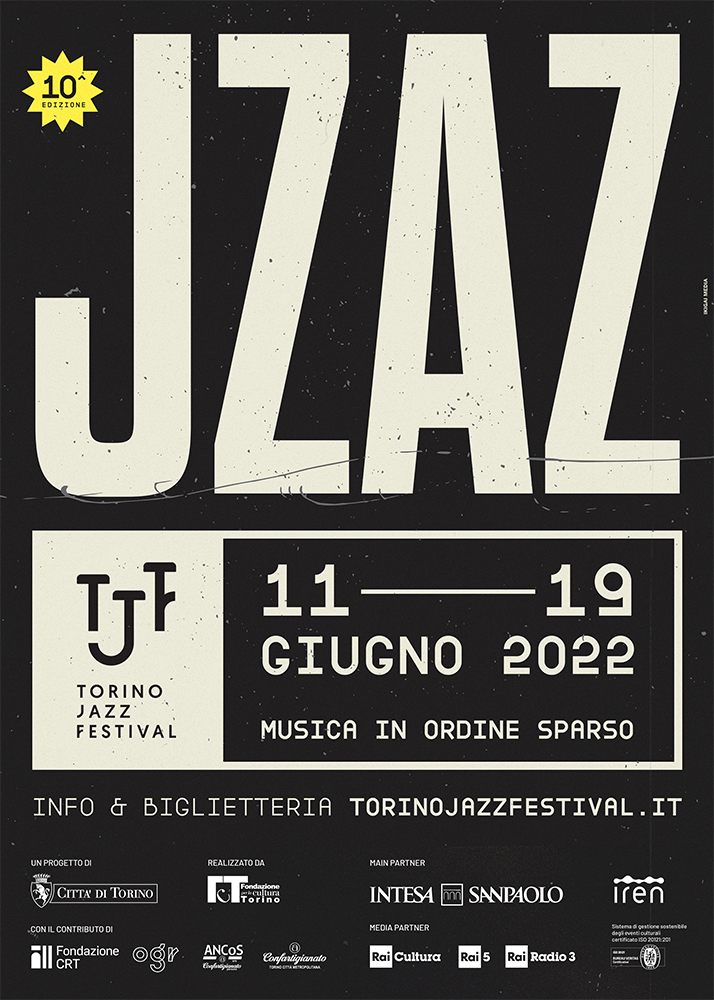
Did you know that if you change the order of some letters, keeping the first and last in their original position, you can still read the entire word?
